The Artsopolis Event Calendar module remains one of the most robust solutions in the industry. Visually powerful, easy to manage, our event calendar is loaded with features and continue to expand as our network members help guide the development of our product.
Event listings can be managed from both the ‘front end’ user dashboard and administrative control panel. All submissions require approval by the website’s content administrator, though subsequent edits by front end users can be set to bypass the administrative review process. If the bypass option is activated then all listing edits will appear on the website immediately.
An unlimited number of event categories (and sub-categories) can be added. We also support “hidden” category types that can be made available on the event submission form, but not visible to the public. The purpose of such types are often as a means of gathering and sharing event listings that may not appear on the website itself, but will be made available to other calendaring partners via our Content Syndication module.
Our display management tool allows you to select events for spotlighting or featuring on the home page and all event category pages. Multiple events can be selected for spotlighting or featuring in advance, ensuring that your most important events are always prominently displayed. And, we also provide an ‘auto fill’ feature that ensures that if you have not selected any events for spotlighting or featuring that there will always be events to fill in those valuable positions.
Title/Event Name – The title of your event. Avoid using the same title twice as that will cause problems. You can use commas, apostrophes, quotes, hyphens/dashes and other typical symbols like “My Site – Here’s Lookin’ at You, Kid”. WordPress will then clean it up to generate a user-friendly and URL-valid name of the event (also called the “post slug”) to compose the permalink for the event.
Permalink – Our system automatically generates an event slug and displays it as the event URL just below the post title. You can edit the URL slug by clicking on the edit link below the post title.
Event Description – The blank box where you enter your event description, links, and any information you want to display on your site. You can use either the Visual or the Text view to compose your posts. Visual Editor is a beginner friendly text editor with formatting buttons and a nice visual layout for content area. On the other hand, text editor is a plain text editor where you can actually see the HTML or write your own. A word count is provided at the bottom of the description field as well as the autosave status.
Summary – A brief teaser for your event featured on the event detail page.
Event URL – This field can be used for the event’s direct URL or the presenting org’s homepage URL
Dates/Times – You will also be asked to provide the individual date or date range, day(s) of the week, and start time(s) info for your event. This is a critical piece as this information is used both in our search function and our sharing of event listings with other community partners.
Admission – This field is for ticket pricing and any other information related to the admission price.
Organization – The organization drop menu contains a list of all your registered organizations. You can select the presenting org from this listing or enter a temp organization if they are not registered on your site. You can also add “secondary” organizations if the event is being co-presented with another group.
Venue – The venue drop menu contains a list of all your registered venues. You can select the event location from this listing or enter a temp venue name and address if they are not registered on your site.
Accessibility Info – Some events include accessibility offerings such as sign language that are not specifically part of the venue accessibility package. If that is the case with the event, you can select the ones that apply.
Video – The event submission form accepts video share links provided by YouTube.com and Vimeo. A video added to this form will appear on event detail page.
Contact Info – Name, email and phone number of the org contact. This information does not appear on the front end event detail page.
Discussions – Options to enable interactivity and notification of your events. This section hosts two check boxes: Allow Comments on this event and Allow trackbacks and pingbacks on this page. If Allowing Comments is unchecked, no one can post comments to this particular event. If Allowing Pings is unchecked, no one can post pingbacks or trackbacks to this particular post.
Revisions – A list of all revisions made to the current event page. Clicking on a revision will open a dedicated revision change where you can compare the current version of the event page with any previous versions. There is also an option to restore any previous versions.
Right Column
Publish Box – Contains buttons that control the state of your event listing. The main states are Published, Pending Review and Draft.
- Save Draft button stores a draft of the event that you are working on. WordPress also auto-saves your events as you write them.
- Preview button shows a live preview of your event. You can use it to see how your event will look after publishing.
- Status allows you to set a status for your post. WordPress automatically handles post status for drafts and published posts. Unless you are using a plugin to add custom statuses, you don’t need to worry about this option.
- Visibility has three option: public, password protected, and private. These options are for blogging; you don’t need to worry about them.
- Click on the edit link next to Publish, and WordPress will display the time and date options. These options are for blogging; you don’t need to worry about them.
- Copy Event button creates a duplicate of the event form within the same website. The purpose of this Copy Event button is to help content managers who are entering a whole season of events where the info is pretty much the same for all the events except perhaps title and dates. In that case it’s much easier to duplicate an existing event and make a few small edits to the duplicate, rather than post a whole new event from scratch.
- Move to Trash allows you to delete an event listing. Deleted events live under Trash, and you can restore them if you need to for up to 30 days.
- Finally, the Publish button makes your event listing public.
Primary Category – A list of event categories available when submitting an event (or updating an event record). Use this list to best match the event’s primary activity.
Additional Category – A list of event sub-categories available when submitting an event (or updating an event record). Use this list to best match the event’s secondary activity or drill down to a specific activity. For example, if Theatre is the primary category, you can select Musical in the Additional Category list, if available.
Featured Image – The Featured image is the primary image that will be displayed on the site. Simply click on set featured image link, and it will bring up the media uploader popup. You can select an image from your previous uploads or upload a new image from your computer.
Event Gallery – Multiple images may be uploaded along with the event’s Featured image. These images will display on the event page in the Gallery area.
Associated User –
Artist –
Top of Event Form
Screen Options – Some of the options on the event form are hidden by default to present a cleaner and simpler editing experience. These options are not commonly used by beginners. However, you may need them later. Simply click on the Screen Options button on the top right corner of the page. This will show a menu with checkboxes next to option names.
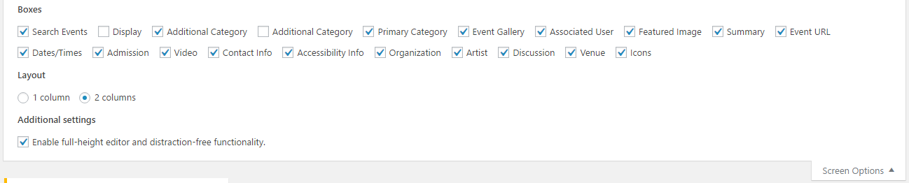
As you can see most of the options will already be checked. For the others, you can display them by clicking on the checkbox next to an option name, and it will appear on your page.
Visual Versus Text Editor Toolbar
When writing your post, you have the option of using the Visual or Text mode of the editor. The Visual mode lets you see your post as is and format using the WYSIWYG toolbar.
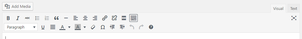
Functions include:
- Bold – Turns selected text into bold text.
- Italics – Turns selected text into italicized text.
- Strikethrough – Turns selected text into
strikethrough text. - Bulleted list – Turns the selected text into an bulleted list.
- Numbered list – Turns the selected text into a numbered list.
- Blockquote – Blockquote is a block-level element that can be used to set-off quotations or to cite material.
- Horizontal line – Adds a horizontal rule.
- Align left – Moves all selected text to the left.
- Align center – Centers all selected text.
- Align right – Moves all selected text to the right.
- Add/edit link – To create a hyperlink, select the text or image for the link, then click on the Add/Edit Link icon and paste the target URL. For links external to the site, click the “gear” icon to open the link options and check the “Open link in a new tab” checkbox. Click the Add Link button to insert the hyperlink just created. Click Cancel to close the window and return to the editor.
- Remove link – Select the hyperlink and click on the Remove Link icon to remove a hyperlink.
- Insert read more tag – For blogging only. Allows you truncate your blog posts so you can display a post excerpt on your main pages.
- Toolbar toggle – Enables the second row of editing icons.
- Underline – Turns selected text into underlined text. Please note that underlined text usually means that a word or phrase is a link to another web page. In this case however, the underline formatting does not create a link (to create a link, see the Insert/Edit Link icon).
- Justify – Justifies text making it flush on both the left and right sides.
- Font color – This icon sets the color of any selected text. To start typing new text with a specific font color, click on the cursor at the location where new text is to be inserted, select a color from the drop-down list, then begin typing.
- Background color – This icon sets the background color of any selected text.
- Clear formatting – To remove all formatting for a selection, highlight the text to be updated and click on the Clear Formatting icon. This returns the selected text back to the default settings.
- Special character – To insert a special character such as an copyright symbol, registered trademark, or other symbol, click the Insert Special Character icon. The Special Character modal provides a selection of 200 special characters from which to choose. Hover or use the left and right keyboard arrows to navigate the selection. Clicking a character will add it to the page and close the modal.
- Decrease indent – To decrease the indent of a paragraph, click on the Decrease Indent icon. Each consecutive click will move text further to the left.
- Increase indent – To increase the indent of a paragraph, click on the Increase Indent icon. Each consecutive click will move text further to the right.
- Undo – Click on the Undo icon to undo the last changes made in this session one-by-one.
- Redo – Click on the Redo icon to redo changes that were just undone and should be restored.
- Keyboard shortcuts
The Text mode shows you the code and replaces the WYSIWYG editor buttons with quicktags.
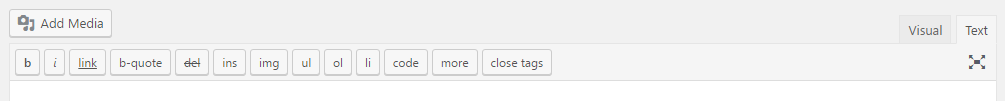
These quicktags are explained as follows.
- b – <strong></strong> HTML tag for strong emphasis of text (i.e. bold).
- i – <em></em> HTML tag for emphasis of text (i.e. italicize).
- link – <a href=”http://example.com”></a> HTML tag to create a hyperlink.
- b-quote – <blockquote></blockquote> HTML tag to distinguish quoted or cited text.
- del – <del></del> HTML tag to label text considered deleted from a post. Most browsers display as striked through text.
- ins – <ins></ins> HTML tag to label text considered inserted into a post. Most browsers display as underlined text.
- ul – <ul></ul> HTML tag will insert an unordered list, or wrap the selected text in same. An unordered list will typically be a bulleted list of items.
- ol – <ol></ol> HTML tag will insert a numbered list, or wrap the selected text in same. Each item in an ordered list is typically numbered.
- li – <li></li> HTML tag will insert or make the selected text a list item. Used in conjunction with the ul or ol tag.
- code – <code></code> HTML tag for preformatted styling of text. Generally sets text in a monospaced font, such as Courier.
- more – <!–more–> WordPress tag that breaks a post into “teaser” and content sections. Type a few paragraphs, insert this tag, then compose the rest of your post. On your blog’s home page you’ll see only those first paragraphs with a hyperlink ((more…)), which when followed displays the rest of the post’s content.
- close tags – Closes any open HTML tags left open–but pay attention to the closing tags. WordPress is not a mind reader (!), so make sure the tags enclose what you want, and in the proper way.
Questions or suggestions? Contact: networksupport@artsopolis.com